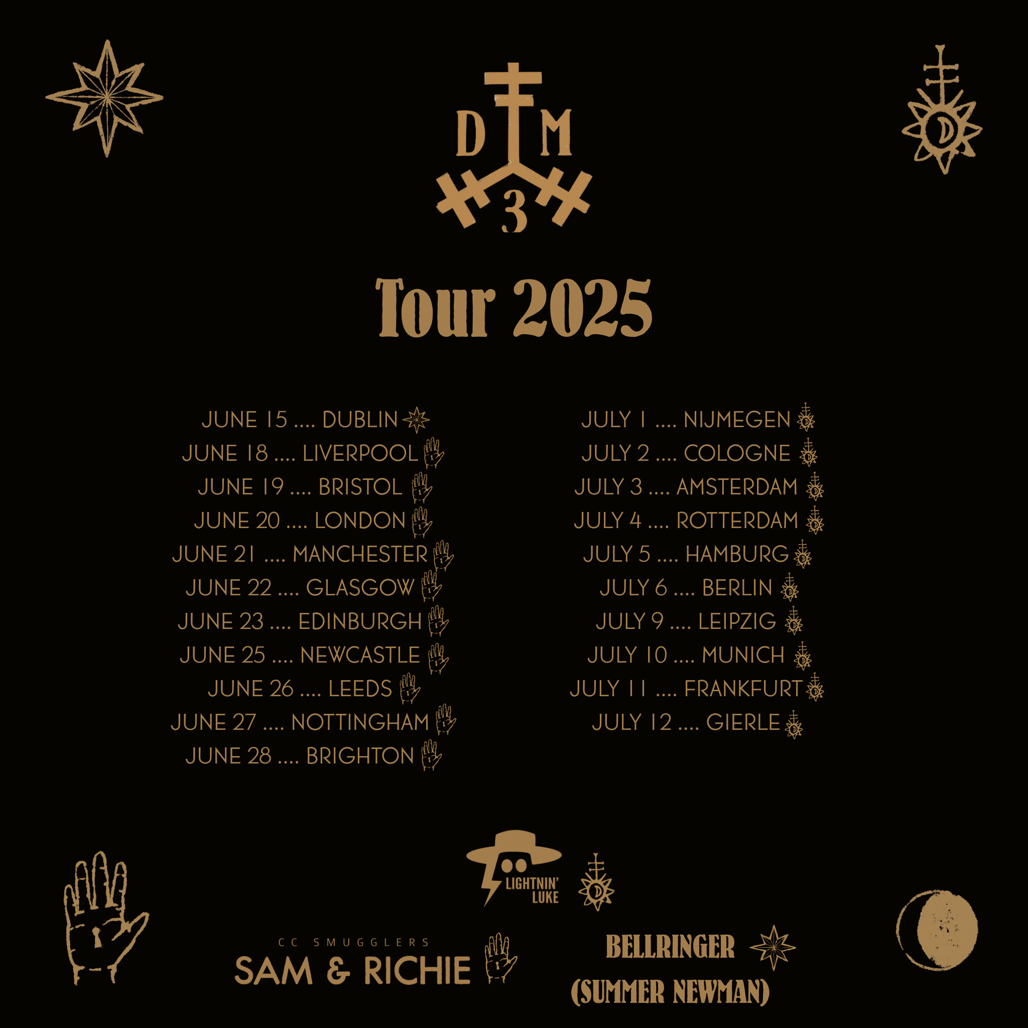

Digital Re-Creation of a Band Member’s Original Drawing - Authentic and Bold Symbol Design
This project involved digitally re-creating a hand-drawn symbol originally created by one of the band members. Maintaining the integrity of the original artwork was paramount; every line’s weight and length needed to be precise to preserve the symbol’s character and energy.
The design called for a bold presence but without being overly polished or sterile. To achieve this balance, the symbol was carefully refined digitally while intentionally retaining a handcrafted feel. The distinctive distressed effect was created entirely by hand using Procreate on my iPad, adding texture and depth that gives the symbol its unique, raw edge.
This emblem has since become a key visual element in the band’s social media assets, complementing the stunning album artwork created by artist Kat Catmur.
Together, they form a cohesive, compelling aesthetic that resonates deeply with fans and reflects the band’s authentic creative spirit. The majority of tour dates these assets were used to promote sold out!